Brand & Press Kit
Logos, icons, colors and type for StoryGrid. Use the SVGs on the web wherever possible; PNGs are for app stores, social and docs. Press & partnership questions: info@story-grid.app.
Logo
Color on light, color on dark, and one-color (mono) lockups.
Primary — color on light
Default lockup. Use on white / paper backgrounds.
Color on dark
White wordmark for dark / photo backgrounds.
Stacked
Vertical lockup for square / centered placements.

Mono — black
One-color. Print, watermarks, single-color contexts.


Mono — white
One-color reversed. For dark single-color contexts.

Icons
App icon, marks, favicons and platform icons.
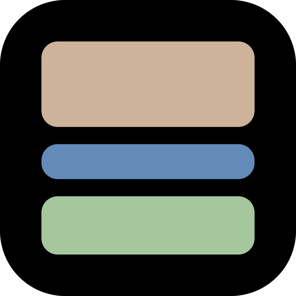
App icon
1024² iOS squircle.
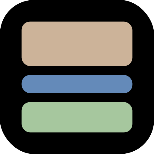
Mark — color
Glyph only. Favicons, avatars, badges.
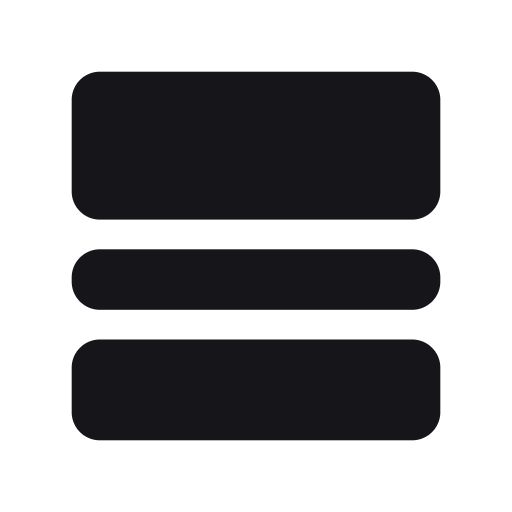
Mark — black
Mono glyph for light contexts.

Mark — white
Mono glyph for dark contexts.

Favicon
Browser tab icon.


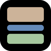
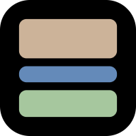
Web & touch icons
Apple touch + Android Chrome raster icons.
Colors
The palette we ship.
Core
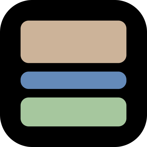
The three mark bars.Beige
#ccb399
Mark — top bar / warm accent
Blue
#648ab9
Mark — middle bar / cool accent
Green
#a6c79e
Mark — bottom bar / primary accent
Extended
Accents & optional pastels.Signal Green
#00E27E
Web accent — CTAs, highlighted words, the privacy lock
Coral
#EB5D43
Web — a photo block in the band figures
Pink
#E5C3C8
Optional pastel accent
Lilac
#C9BEE6
Optional pastel accent
Neutrals
Surfaces and text.Ink
#16161A
Primary text on light
Black
#0B0B0C
App background / dark surfaces
Pure Black
#000000
Logo container (squircle)
Surface
#1C1C1E
Cards on dark
Mute
#8A8A90
Secondary / captions
Paper
#FAFAFA
Light background
White
#FFFFFF
Text on dark
Typography
Outfit — the StoryGrid brand typeface (self-hosted).
Wordmark & app
Stories, perfectly divided.
Outfit · weight 800 · tracking -0.035em · the lockup and every screen of the iOS app
Web display
Thirds are a default, not a rule.
Poppins · weight 800 · tracking -0.035em
Web text
Split photos into seamless vertical grids.
Poppins · weight 400–600
Mono
1080 × 1920 · 3 × 2 grid
IBM Plex Mono · weight 400–500 · labels, dimensions, percentages
Usage
Keep the mark calm and consistent.
Do
- Keep clear space ≥ the height of one mark bar.
- Prefer SVG on the web for crisp scaling.
- Switch variants to keep strong contrast.
Don't
- Recolor, rotate, stretch or add shadows to the mark.
- Place the color-on-dark lockup on busy or light backgrounds.
- Rebuild the wordmark in a different typeface.